Read The Fracture
We start by locating what the current brand expression is failing to say, not by decorating what already exists.
Client Work / Books / Decks / Systems
We use brandbooks, pitch decks, and identity studies to make sure the narrative, the visual system, and the business intent are all saying the same thing.
We start by locating what the current brand expression is failing to say, not by decorating what already exists.
The strongest design decision is usually a narrative decision first: care instead of dominance, motion instead of passivity, lineage instead of product listing.
Type, color, imagery, interface, deck architecture, and sequencing all need to make the same argument from different angles.
Once the idea is sharp, we turn it into a usable system so the brand can hold its shape across decks, social, web, and motion.
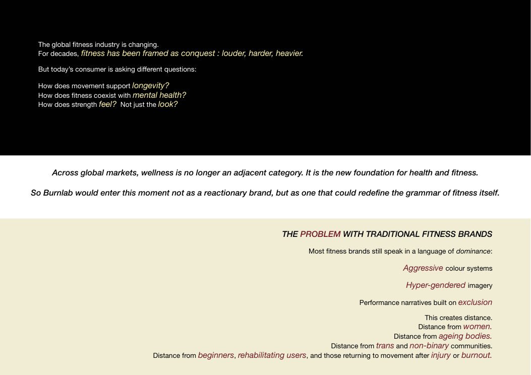
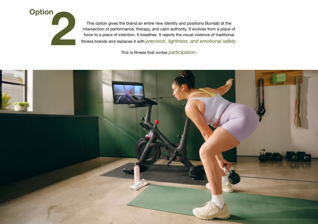
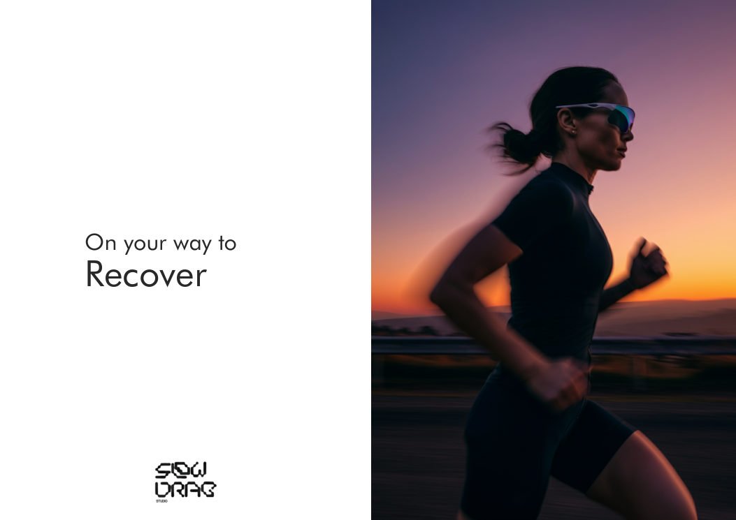
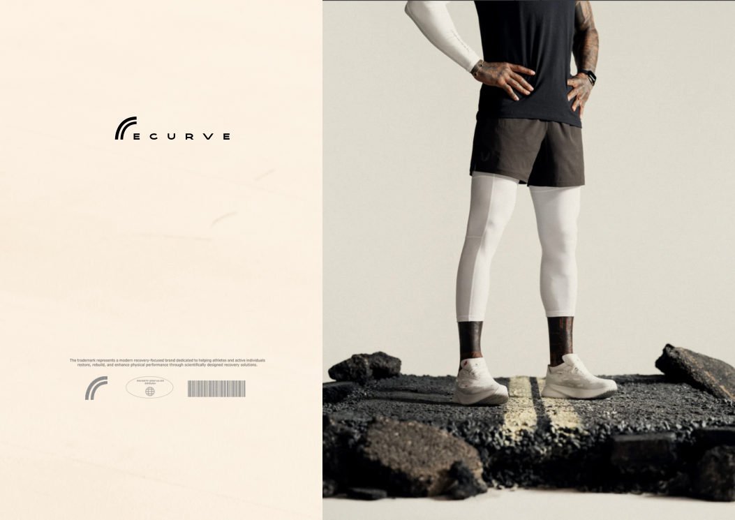
Traditional fitness branding still speaks in conquest: aggressive color, hyper-gendered imagery, and a distance from beginners, recovering bodies, and people returning to movement after burnout.
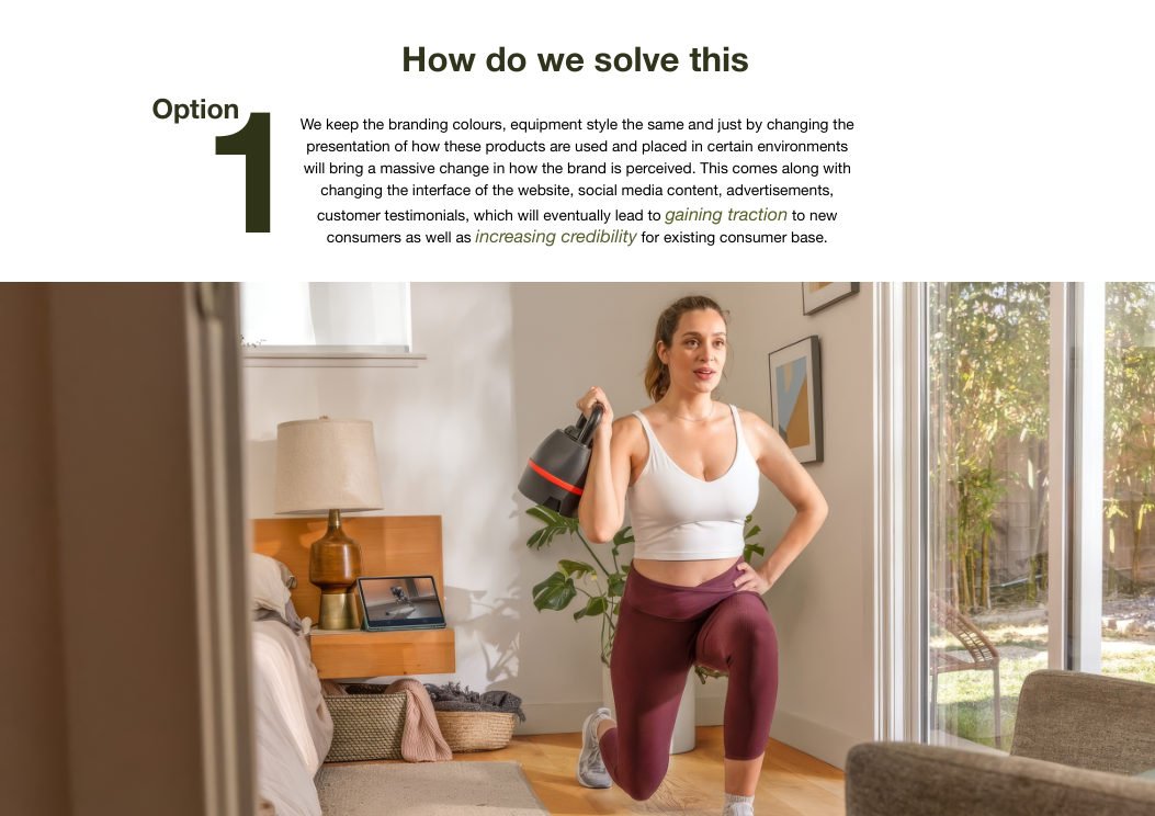
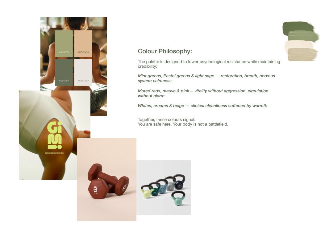
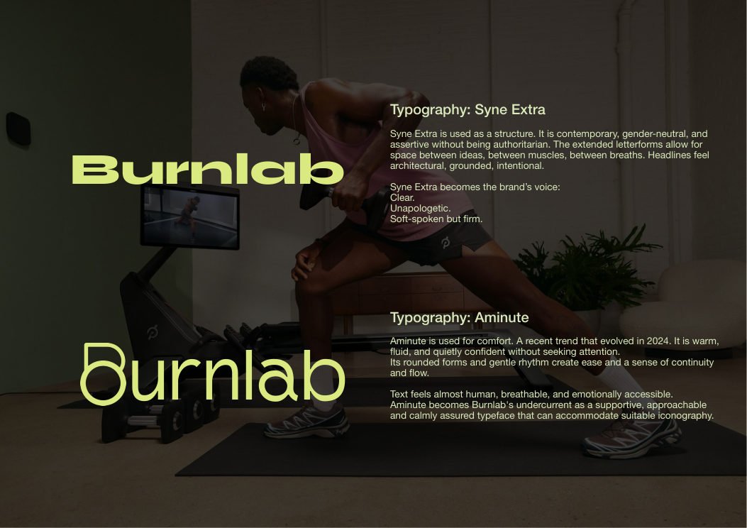
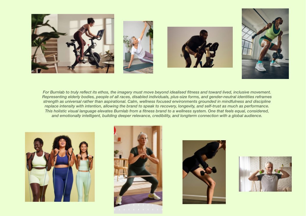
Keep the equipment credible, but change the grammar around it: lighter color psychology, a gender-neutral contemporary typographic voice, more inclusive bodies in the image system, and a calmer website and social interface.
The brand becomes more expansive without becoming soft-focus. It can now speak to longevity, therapy, confidence, and intuitive movement rather than only discipline and dominance.
Recovery brands often drift into spa language or passive-care tropes, which can dilute urgency, credibility, and the physical reality of what recovery actually asks from the body.
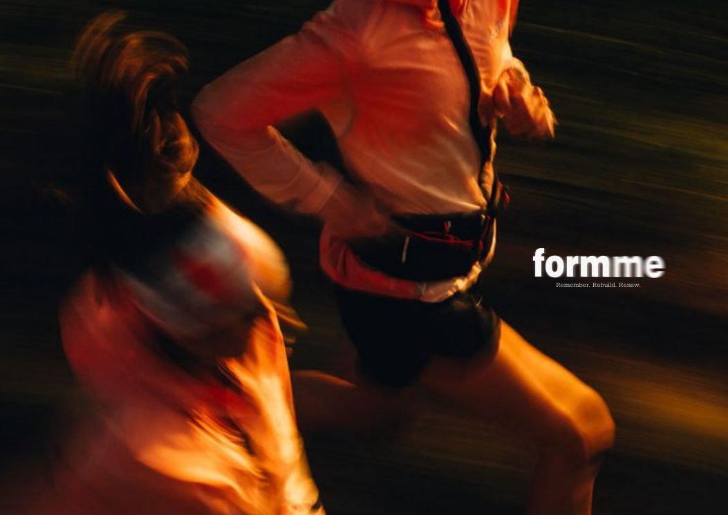
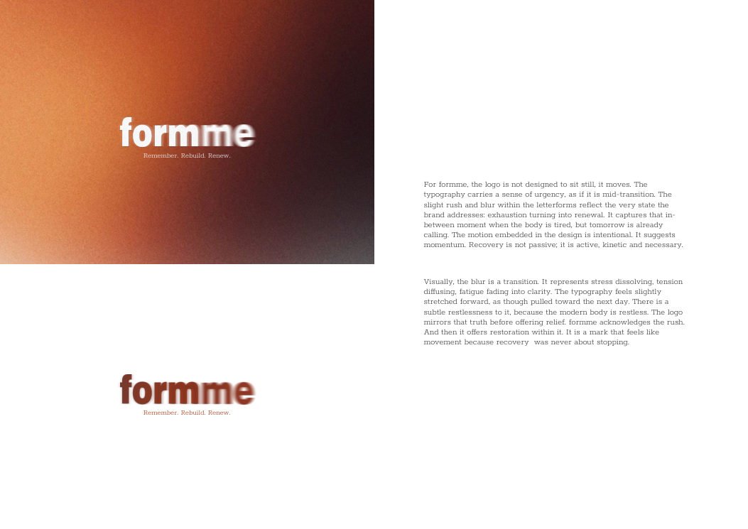
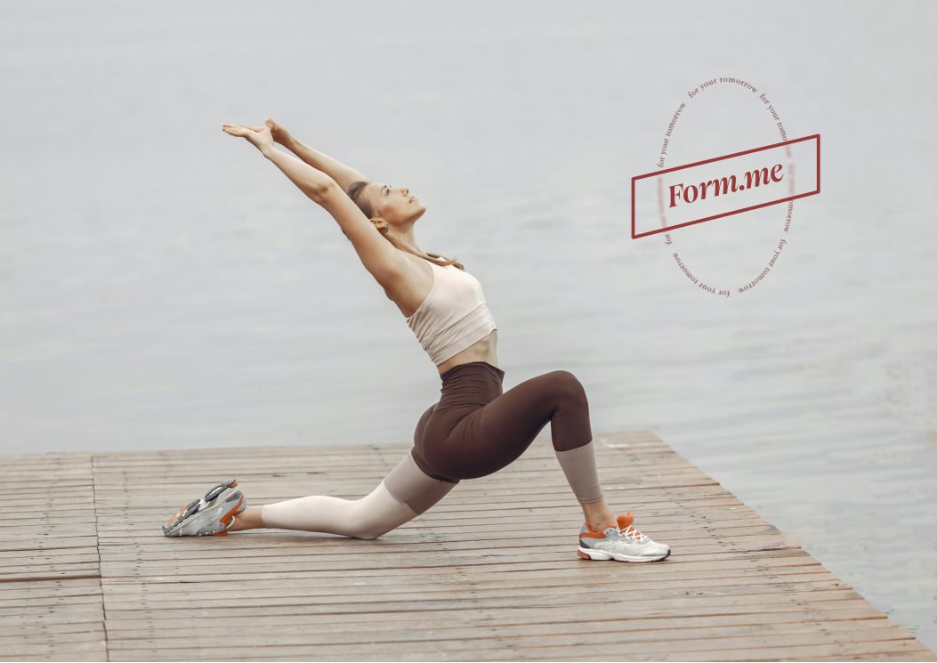
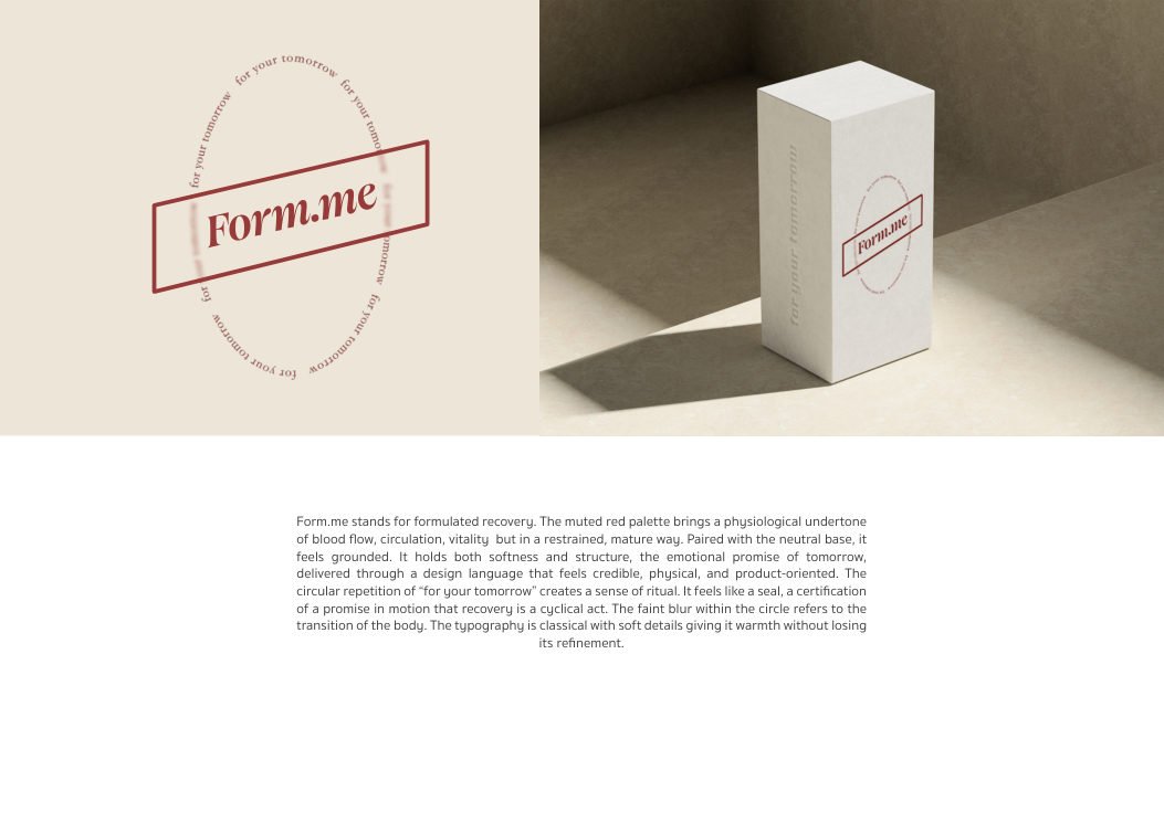
The logo is treated as a form in motion. Slight blur, typographic rush, and a muted red physiological palette make the identity feel like transition, blood flow, and activation instead of stillness.
The brand lands as a system you return to, not a retreat you escape to. It feels credible enough for product and emotionally alive enough for a larger recovery philosophy.
The brand needed to feel elevated enough for aspirational education and sport, but not so polished that it lost warmth, invitation, or a child's intuitive reading of the symbol.
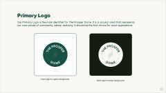
The logo is built from core shapes with narrative function: the dot as seed, the line as bridge, the circle as world. Multiple routes are explored so the final mark carries concept before style.
By showing sketches, alternates, and symbolic reasoning, the deck proves the logo is part of a larger discourse about growth, community, and memory, not just a sports crest.
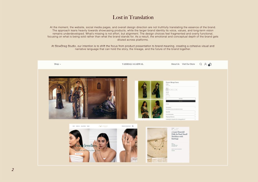
The website, social media, and broader visual language were translating product more than essence. The brand felt fragmented, functional, and under-articulated where it needed atmosphere and coherence.
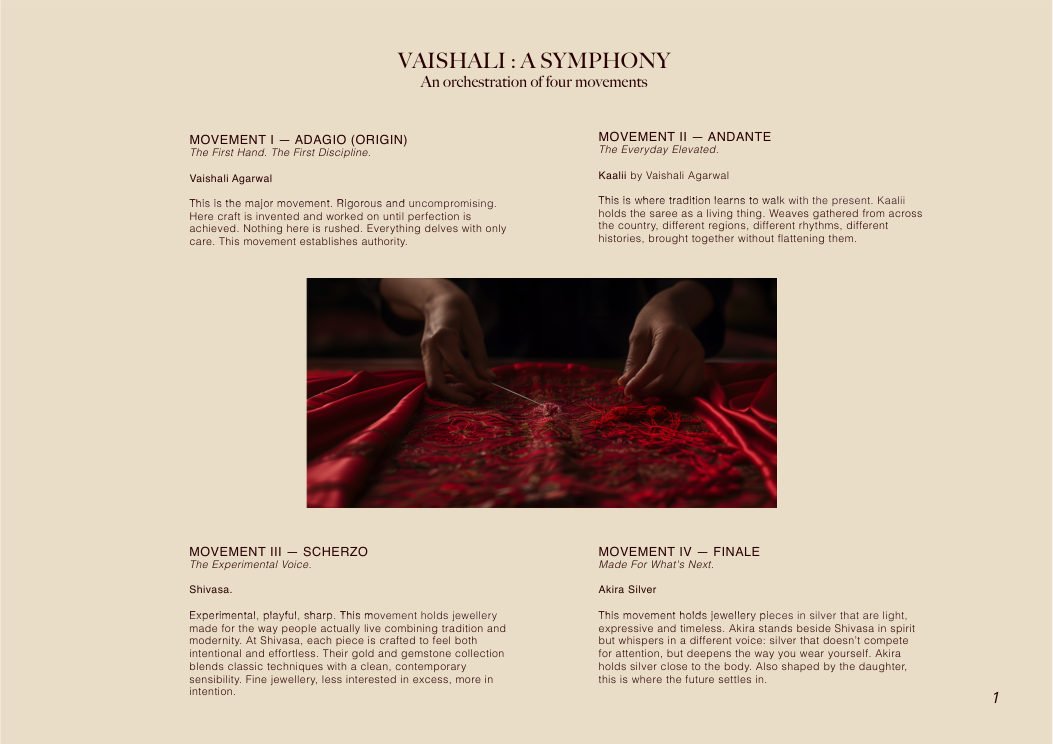
The deck is structured in movements, like music. That lets the brand be framed as an emotional world with rhythm, tempo, and recurring motifs rather than a sequence of disconnected sellable objects.
This kind of deck aligns design, film, website, and social direction under one narrative roof. It turns scattered touchpoints into one authored system with cultural memory.
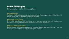
Once the symbol exists, the real challenge is consistency. A brand centered on sanctuary, play, safety, and community can lose its tone quickly if the rules are vague or purely decorative.
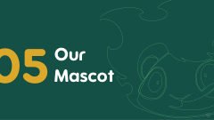
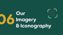
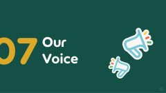
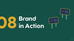
The style guide translates philosophy into behavior: logo meaning, misuse, palette logic, typography, imagery, voice, iconography, mascot, and brand-in-action examples all work together.
The identity becomes repeatable without becoming dead. Teams can apply it across touchpoints while keeping the brand's sense of care, ambition, and belonging intact.
Slow Drag / Client Work
Slow Drag builds the argument underneath the brand, then gives it a surface that can survive contact with the real world. If you need a deck, a system, a repositioning document, or a sharper narrative before launch, this is the part of the practice built for that.